Playa
- Responsibilities
- Research-led product strategyEnd-to-end experience & AI coach designGrowth and monetization
- Role
- Product designer
- Timeline
- 7 months
- Overview
- Playa started as an AI coach that could teach you anything. Before launch, it became clear we were building for everyone, so we committed to one niche: AI coaching for mental health. That decision changed the whole product, from the first session to the course path to the paywall. I designed it end to end.
How it all started
Playa started as one of those ideas that sounds great in a pitch: an AI coach that could teach you anything. Communication, AI literacy, how to be a better partner. I was the designer from the very beginning, when the whole product was that one sentence.
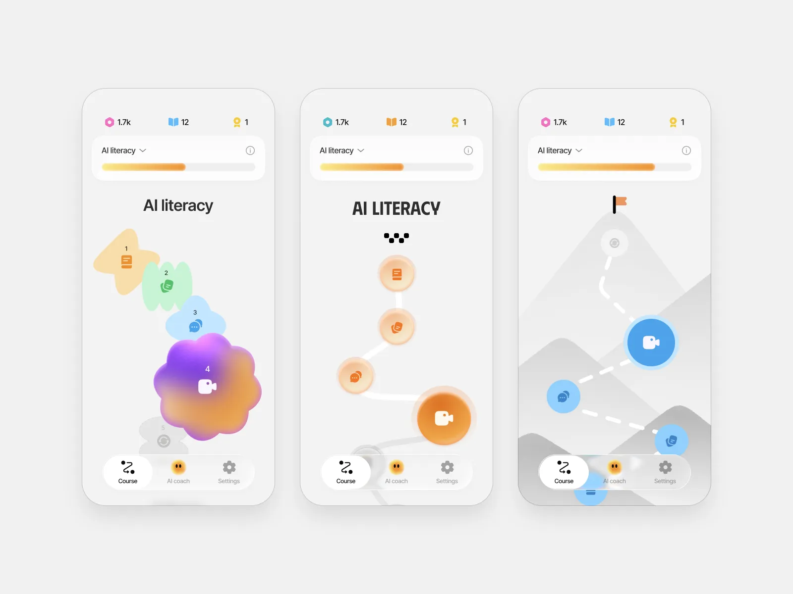
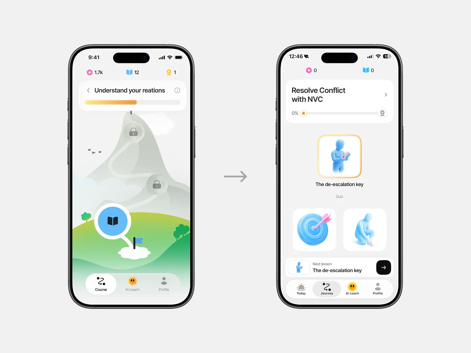
The first question was motivation: people learning on their own tend to quit, and stakeholders bet on gamification to fix that. I explored three concepts for the learning journey and ran unmoderated user tests – the mountain you climb resonated most, so I developed it into a full course map with XP, achievements, and roles that grow as you improve in different parts of your life.
The turn
We hadn’t launched yet, but the closer we got, the more uneasy the strategy felt. Every time we tried to describe our user, we ended up describing everyone, and a product for everyone makes product-market fit a lottery. On top of that, products like NotebookLM had started generating custom courses on any topic, with models and resources we wouldn’t catch up with in a year. Staying on the “learn anything” path meant entering a race that was already lost.
So we went looking for a smaller space we could own. Our CPO researched the market, and one direction kept coming up: AI coaching for mental health. We committed to it, and that decision quietly changed the meaning of everything we’d designed. The gamification everyone loved was built for a learner chasing goals. Whether it made sense for someone struggling with anxiety or their relationship was a question nobody had asked yet.
Research
That question is where I started. I went through the mental-health coaching apps the way a real user would, and it was humbling. Some apps that clearly worked looked barely finished, yet people stayed, because from the first conversation they focused on your actual problem and reflected your patterns back. Playa, for all its polish, didn’t really know its user: two people with completely different struggles moved through the exact same path.
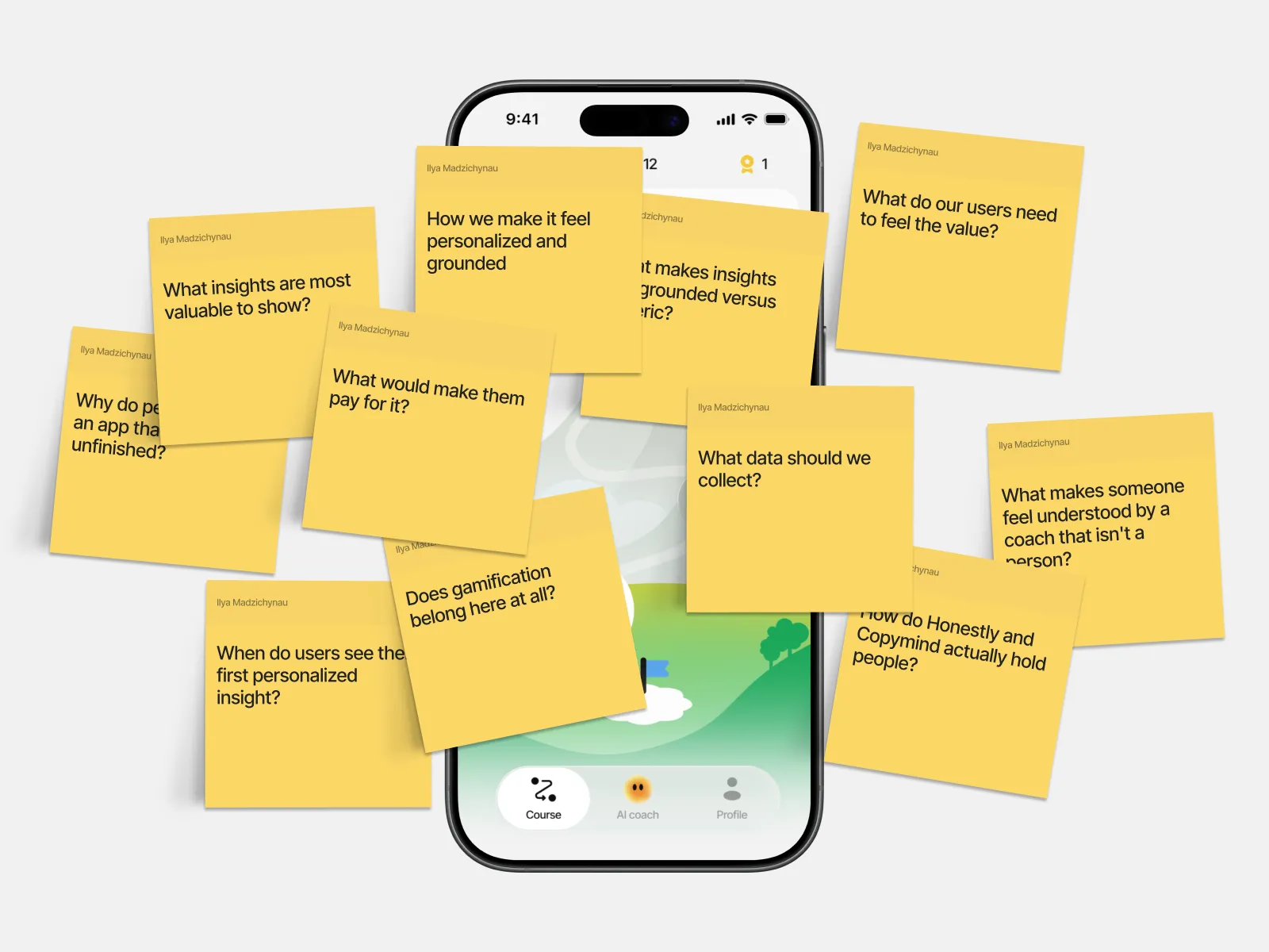
So I brought the research to the team with a proposal to change the mental model: from an app that motivates you to learn anything, to an app that gets to know you in the first session and builds itself around the exact problem you came with.
Key insights
Gamification was engagement without value.
Roles, XP, and streaks kept people busy, but they didn't touch what someone came in with. Someone who shuts down in arguments doesn't need more XP, they need to understand why it happens.
Our personalization was mostly theater.
Two people with completely different struggles moved through the same courses in the same order, and the AI never reflected anything back that proved it was listening.
The value had to land in the first session.
After onboarding we dropped people onto a course page before they'd been heard. That was the moment we were losing them, and the moment we had to win.
The experience
Everything rested on the first session
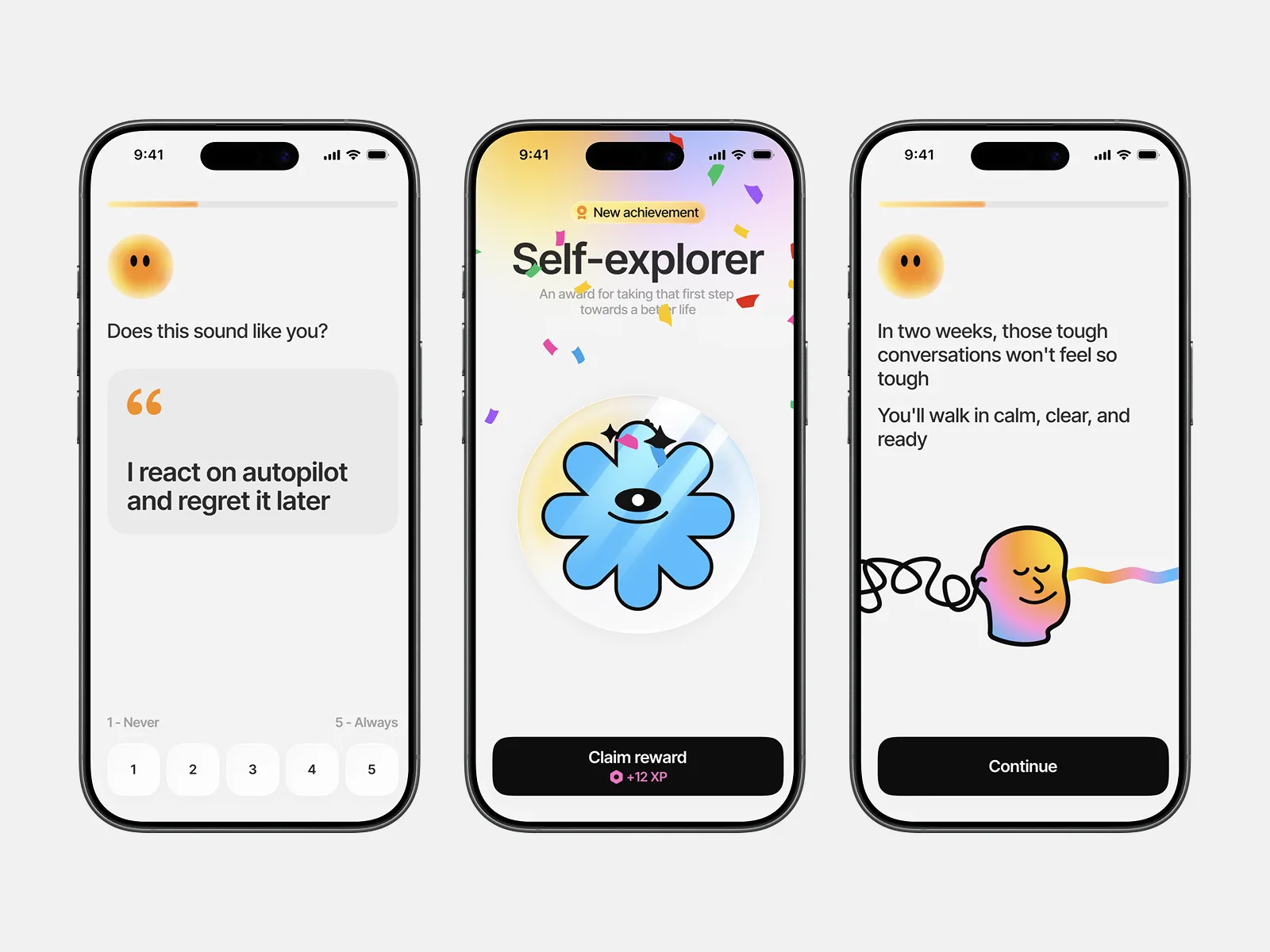
That model put enormous weight on the first session: someone carrying something painful decides fast whether this thing understands them. Onboarding asks a few clarifying questions about what they’re struggling with, and those answers shape a personalized plan and the first session itself, where the coach hears them out, reflects their patterns back, and suggests a way forward. Every session ends with Sunny writing a short, honest summary of what it noticed, so progress reads as your own patterns changing rather than an XP counter.
The journey grows out of that same session: each lesson is built around a piece of what the person came in with, and each is itself a conversation with the coach, a little teaching, then practice you can answer by talking, typing, or tapping.
A space that feels safe to be honest in
Nobody opens up in a space that feels clinical or judgmental, so the goal for the coach was a warmer atmosphere rather than a smarter interface. That’s how Sunny took shape: a round, orange, animated character that closes its eyes while you talk, lights up at a breakthrough, and celebrates small wins with you. Those reactions make the space feel safe enough to be honest in.
Letting go of the mountain
The mountain was designed for a goal-chaser, but people working on their mental health aren’t trying to summit anything – they want support and a clear next step. We still loved the metaphor, so I designed a simpler path built around the person’s needs, and the two views became our first A/B test at launch. The path won, and it’s the version in production today.
Roles that show who you’re becoming
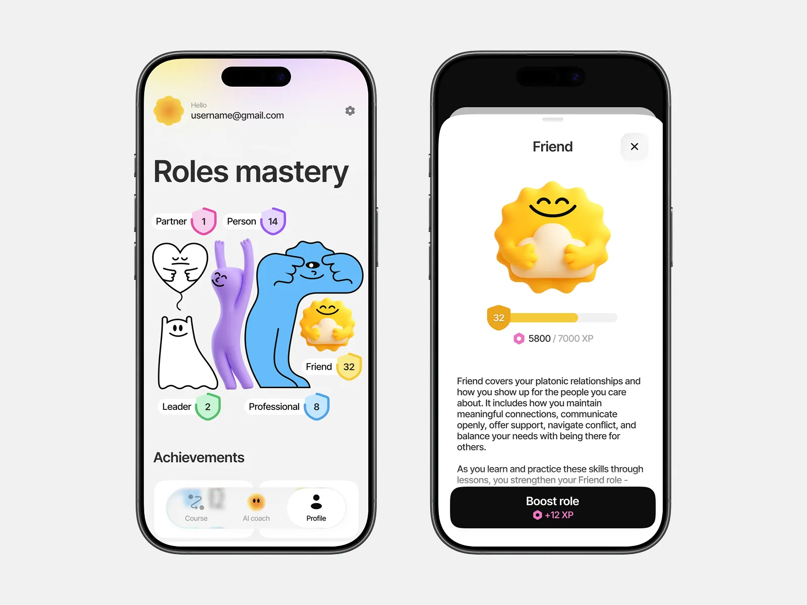
The roles concept came from our Head of Design: instead of abstract points, show growth across the real parts of your life, as a partner, a friend, a professional. I built the level-up system, where each role gains color and becomes volumetric as you progress, and ran unmoderated user tests that narrowed the set to the five roles that resonated most.
Growth & monetization
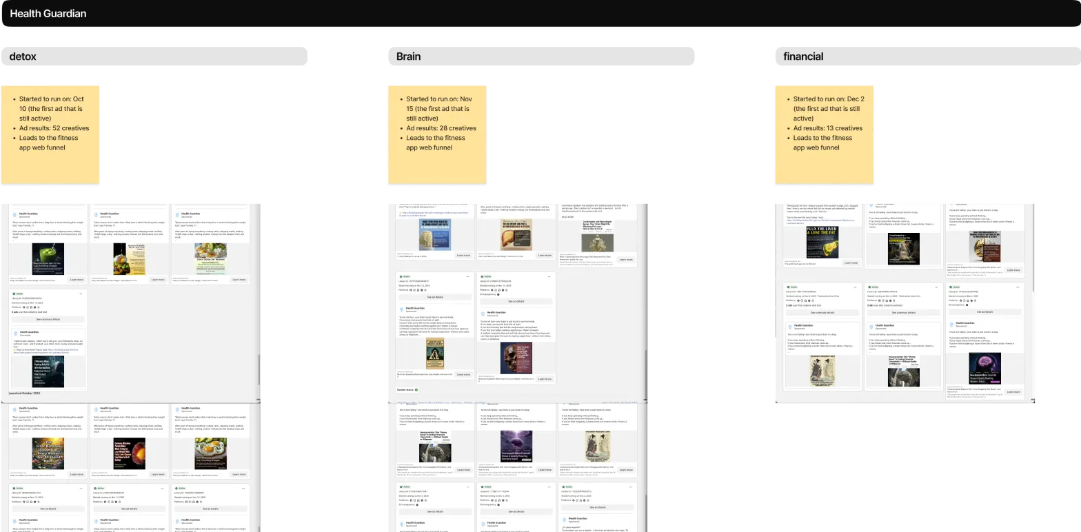
Finding the niche only mattered if we could reach the people in it, so I stepped into marketing too. I pulled competitors’ Facebook ad libraries, used Claude to structure hundreds of ads by topic, angle, and destination, and turned the patterns into messaging rules for our own ads. The funnel that worked followed the product’s logic of meeting people at their actual problem: a resonant ad, an article on that topic, a quiz, and a personalized read with a plan.
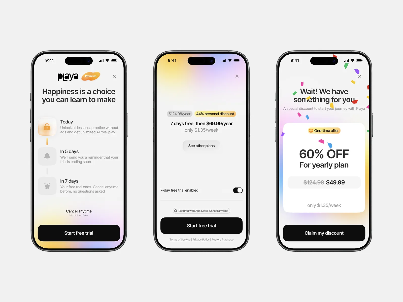
The paywall comes after the full first session, once the value has been felt, so paying reads as “keep going” rather than “pay to find out”, with a free trial, clear pricing, and a scratch-to-reveal discount for people about to leave.
Outcome
The needs-based product shipped and is live today. About a month after the new funnel launched, Playa found its market: within the first month we scaled our marketing spend past $100k with positive ROI.
I moved on before long-term numbers came in, and that data isn’t mine to share. What I can show is the distance covered: from a broad idea nobody could name the user for, to a product people were paying for within its first month.
Key learning
The biggest lesson sounds obvious
Understand who you're designing for before you design. Everything that worked came from finally knowing who was on the other side of the screen.
It's also why I'd get to validation faster next time
We polished before proving what people needed, and part of it had to be redone. Build the leanest version that tests the idea, prove it, then polish.
Emotions are important
Designing Playa taught me to design for how people feel, not only what they get done.
Next steps
Launch wasn’t the finish line so much as the start of the measuring. With the PM, we planned a testing roadmap that went well beyond that first A/B test: running different funnels with different ads to see which topics and angles performed best and how each funnel held up against what we expected.
The same went for the product’s most loaded moment, the first session, where we’d watch how many people who felt heard went on to pay for a subscription. And once people were in, 1, 7, and 30-day retention would show whether the value we promised in that first session was holding up over time.